Almost An Athlete
Project Description
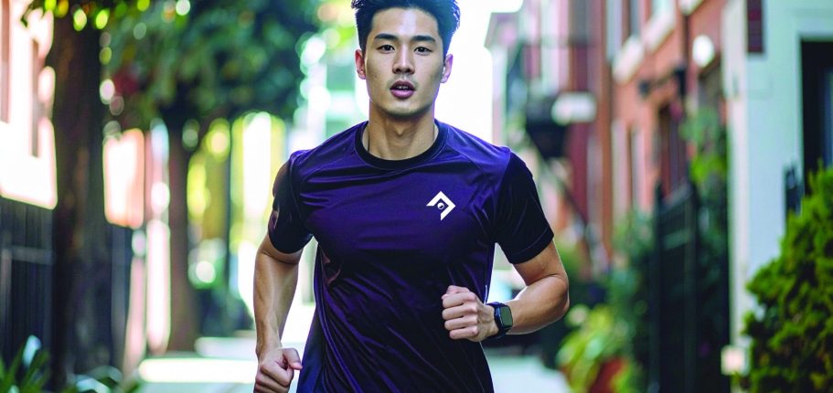
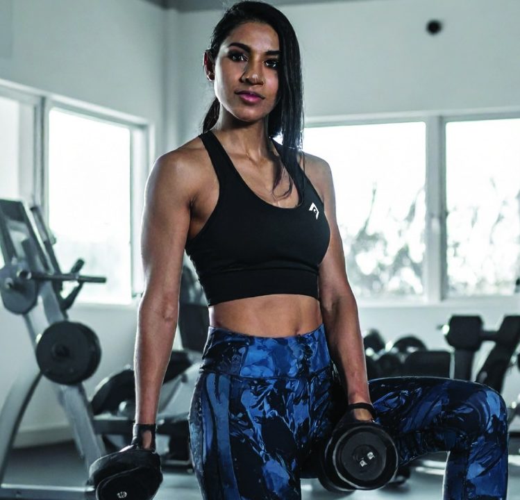
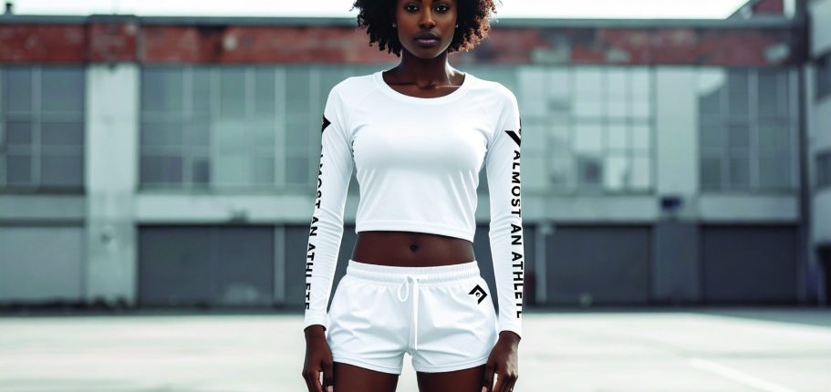
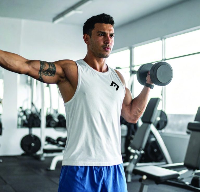
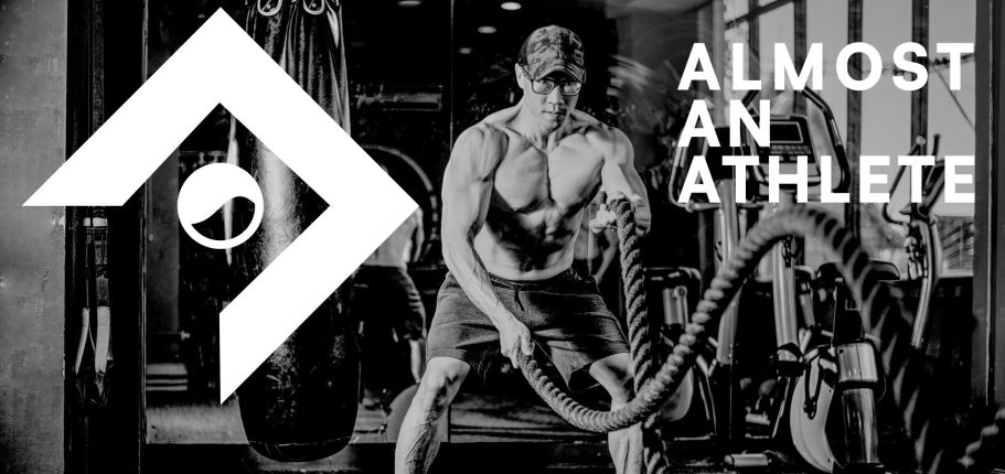
For this project, I created the branding for a social media content creator. The idea behind their platform was to give people the chance to train and work out like an athlete even if they are not one. They also wanted to build a community that could eventually grow into a full company. Because of this, the branding needed to be flexible and able to evolve over time as the creator and their audience continued to grow.
Research & Development
Brand Strategy
The goal of this project was to build a brand that could grow, adapt, and change over time. The initial focus was on the content creator, but the long-term vision was to expand into all areas of the health and wellness industry. Because of this, the brand needed a strong and dependable foundation that could support future growth and allow new elements to be added as the company evolved.
Target Audience
The goal of this brand is to reach anyone with an athletic or active mindset. It also aims to connect with people who may not be athletes but want to train and develop their skills. While this is a broad focus, we prioritized inclusivity and a unisex approach, giving us a clear starting point and a direction to guide the brand’s development.
PROCESS
Sketches
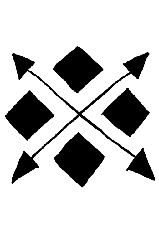
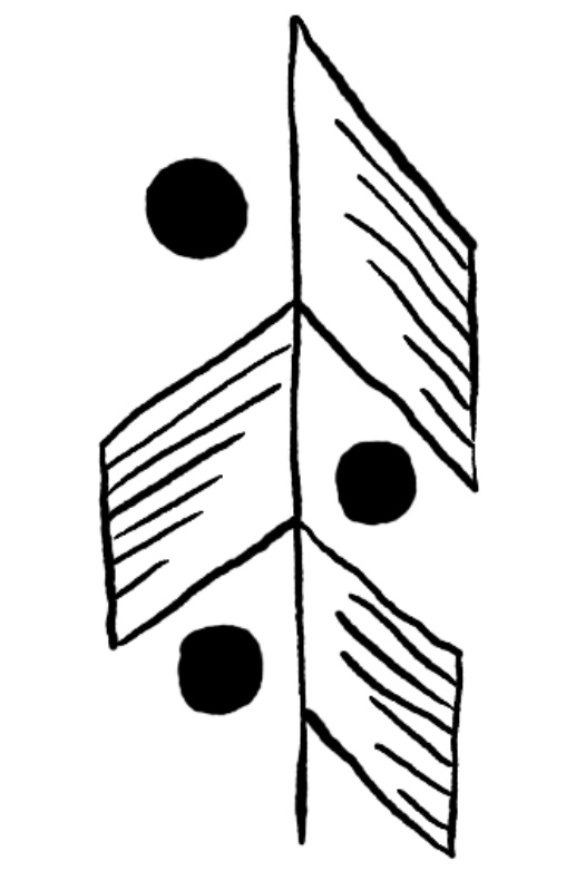
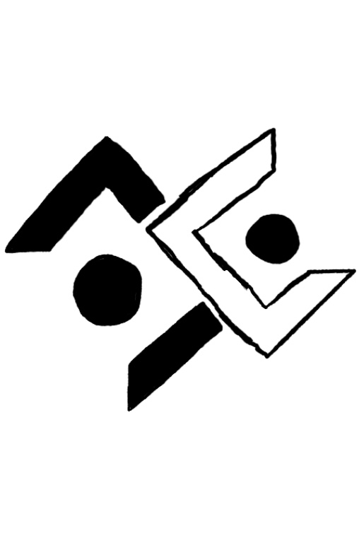
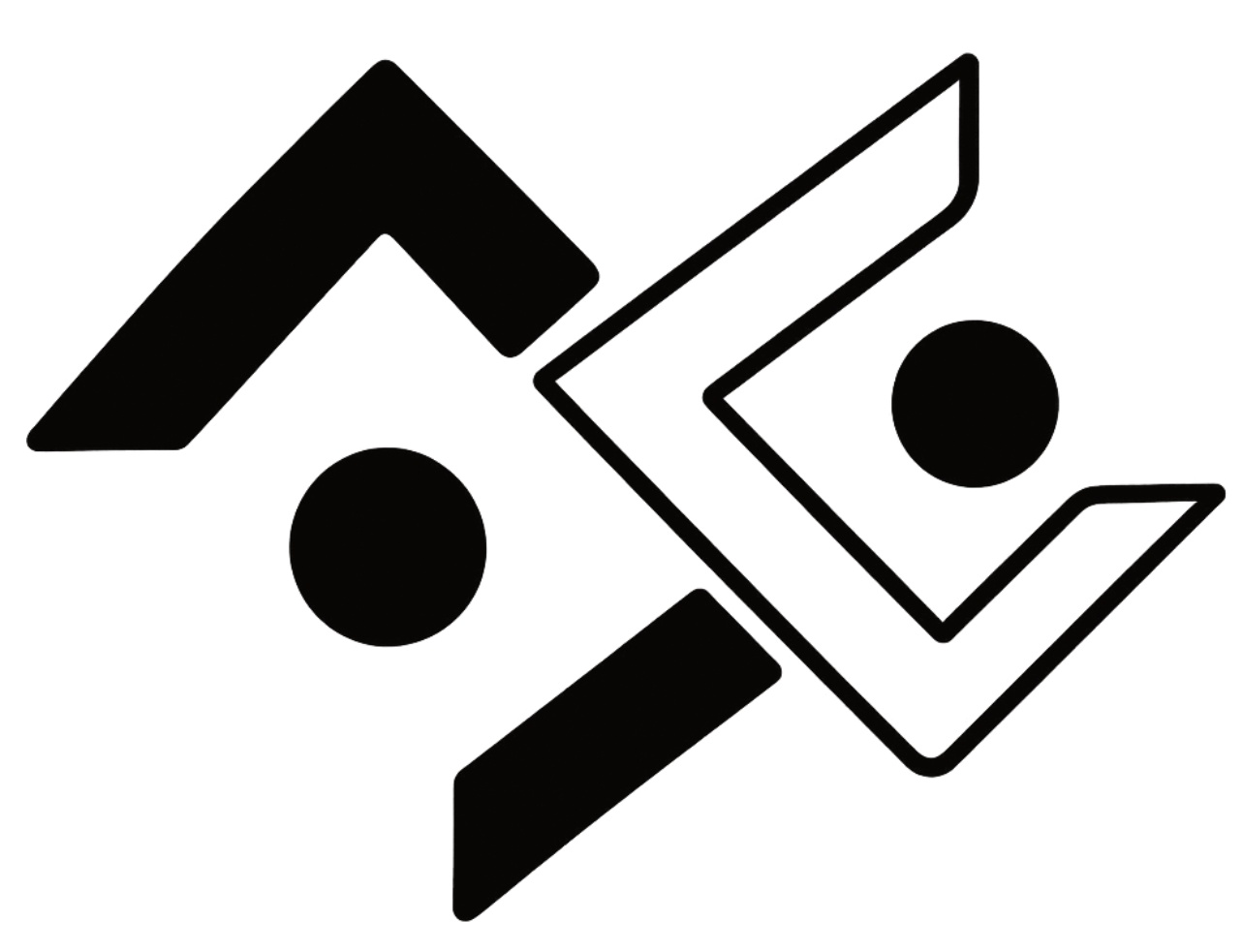
The idea behind the sketches was to create a strong foundation and structure for the brand. We needed a mark that could stand out in the fitness industry while competing with some of the biggest logos in the world, such as Nike and Adidas. We explored concepts that incorporated the letter A in multiple ways as well as symbols that conveyed strength. These sketches provided a solid starting point and allowed us to move into the digital mockup phase, where we could continue to refine and develop the project.
Typography
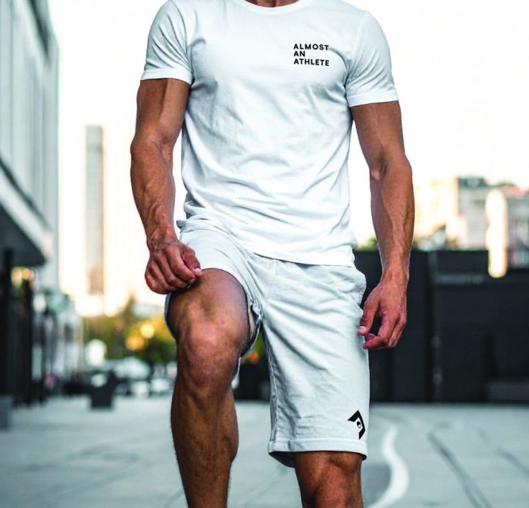
The typeface for this company needed to be versatile, able to stand out boldly when necessary but also blend in when needed. I chose a strong sans serif font that could deliver big, solid lettering and compete with the major brands in the athletic industry.
Color Palette
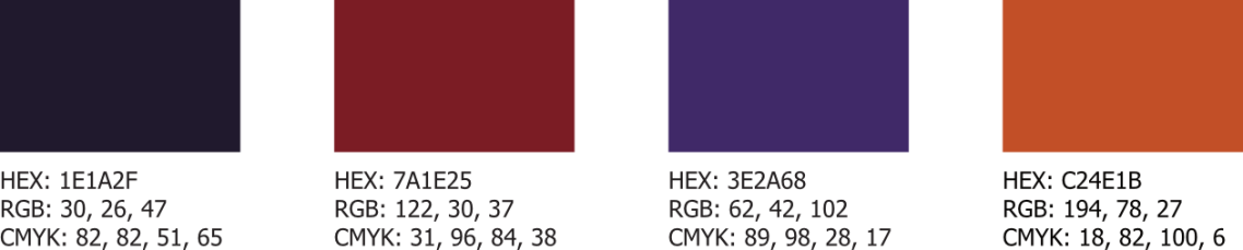
I chose a bold and vibrant color palette for this project to emphasize inclusivity. We wanted the brand to feel welcoming to everyone, and one of the most recognizable symbols of inclusivity is the rainbow. I selected strong colors inspired by the rainbow and then softened them slightly to create a more grunge, gym-inspired aesthetic that could serve as the foundation for the brand’s visual identity.
Digital Drafts
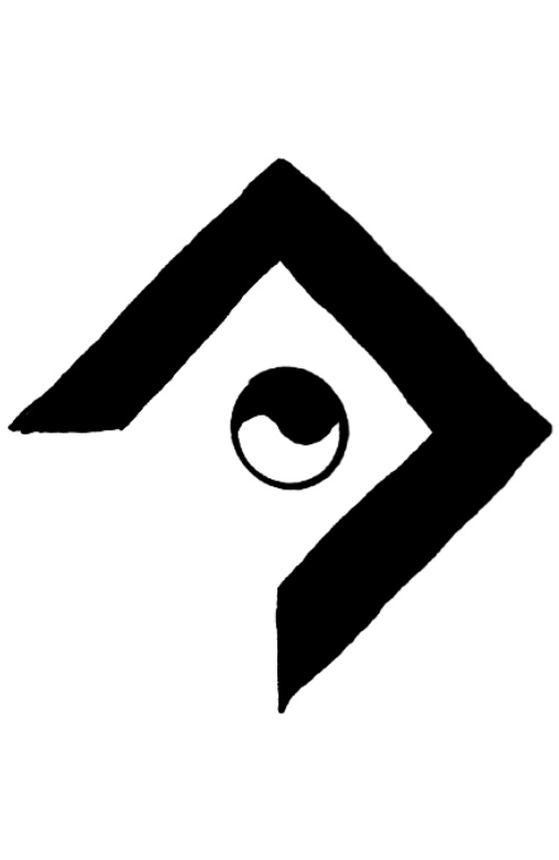
Design Decision
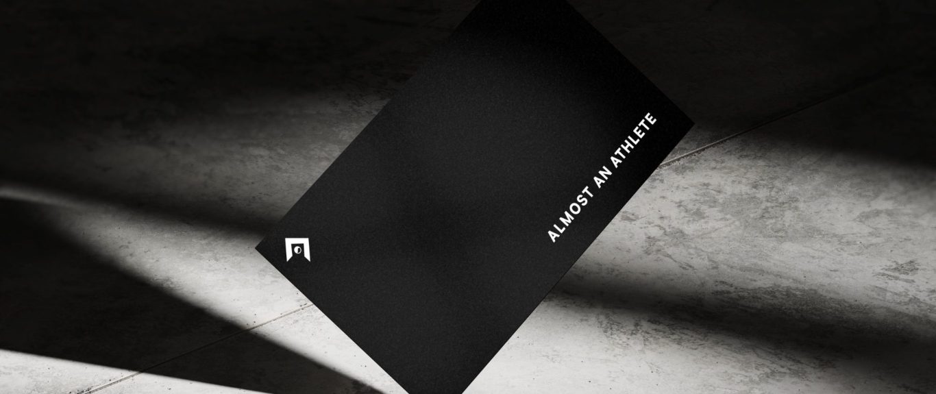
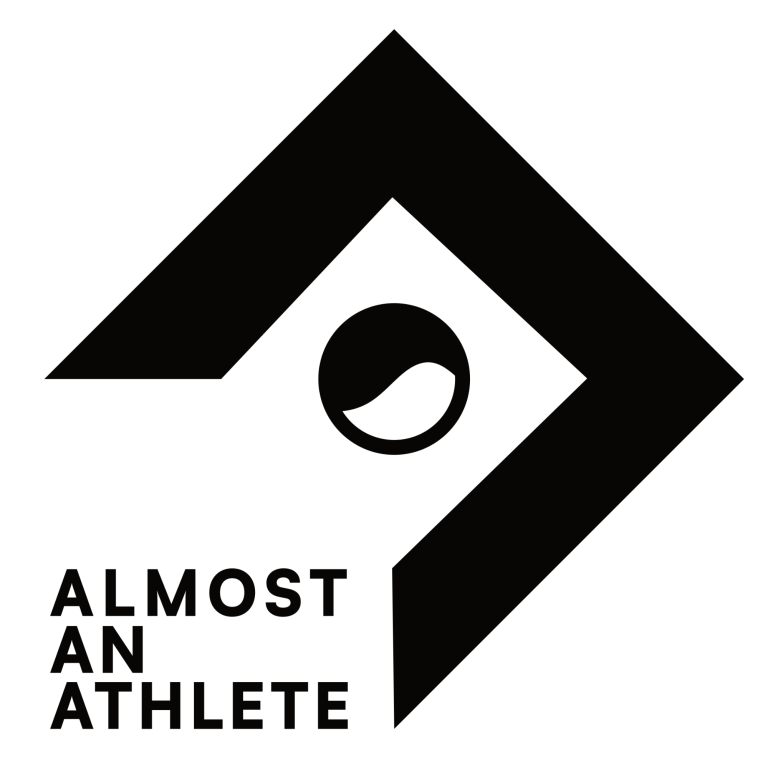
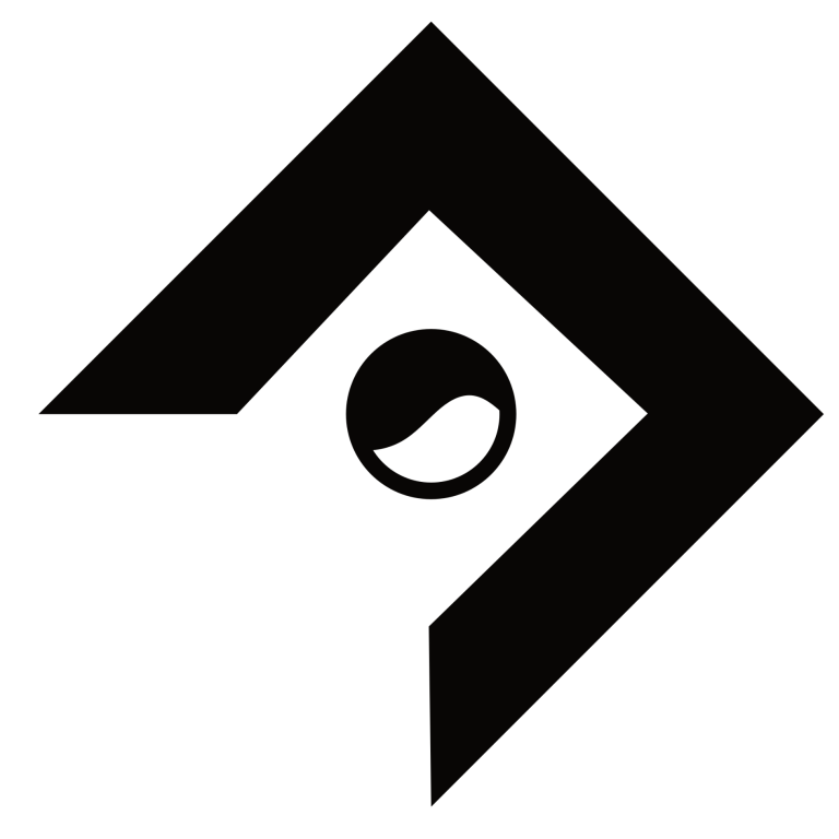
The final design came from an option that had not gone through the digital process initially. After hitting a roadblock, we returned to sketching for a second round. The main goal was to create a simple logo that could stand on its own without text and clearly communicate the essence of the brand. After two rounds of sketches, we were finally able to move forward and develop the design further.
Final Iteration
Stacked
Favicon
Environmental Contact