JKM Designs
Project Description
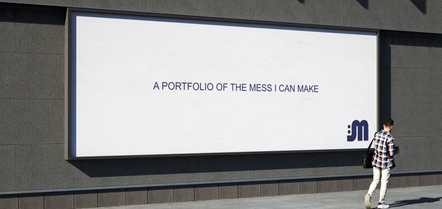
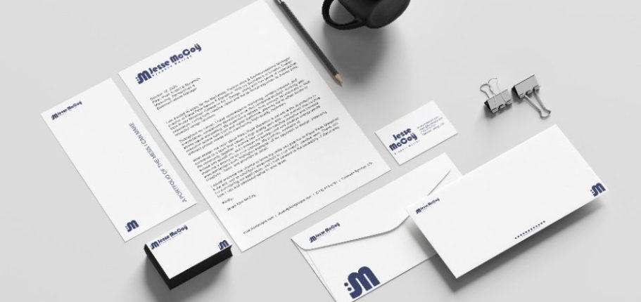
For this project, I developed the branding for my own personal brand. My goal was to present myself as a professional graphic designer across all areas of the field. My main focus has always been branding and creating visual identities for companies, so this direction allowed me to highlight both my passion and the skillset I bring to the world of graphic design.
Research & Development
Brand Strategy
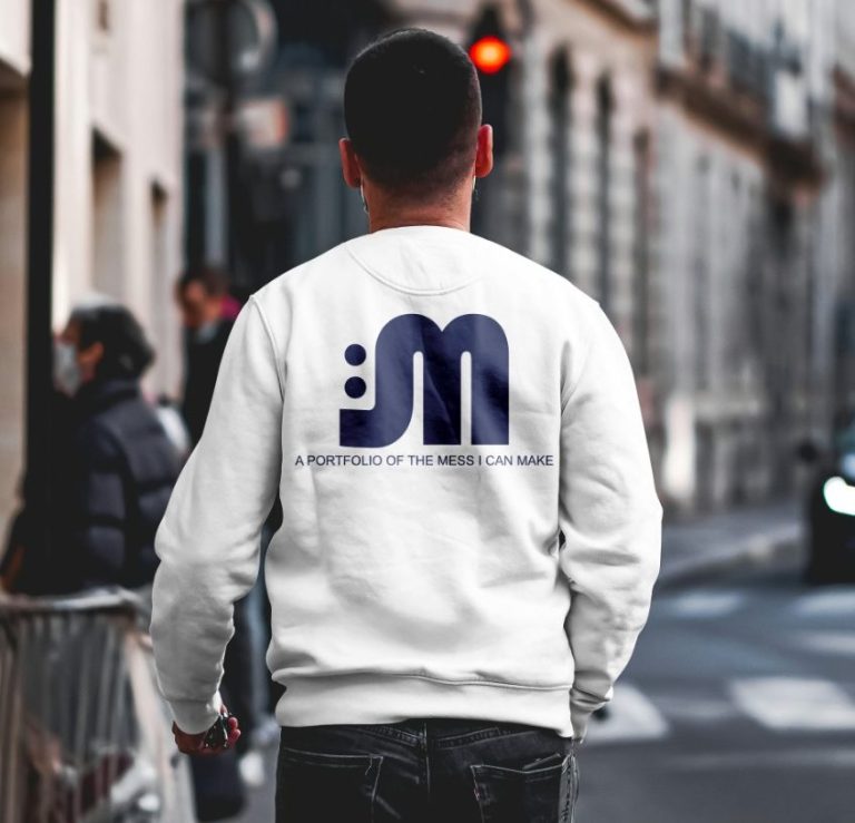
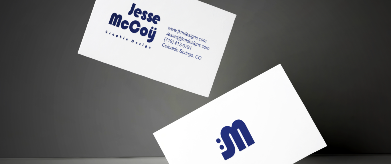
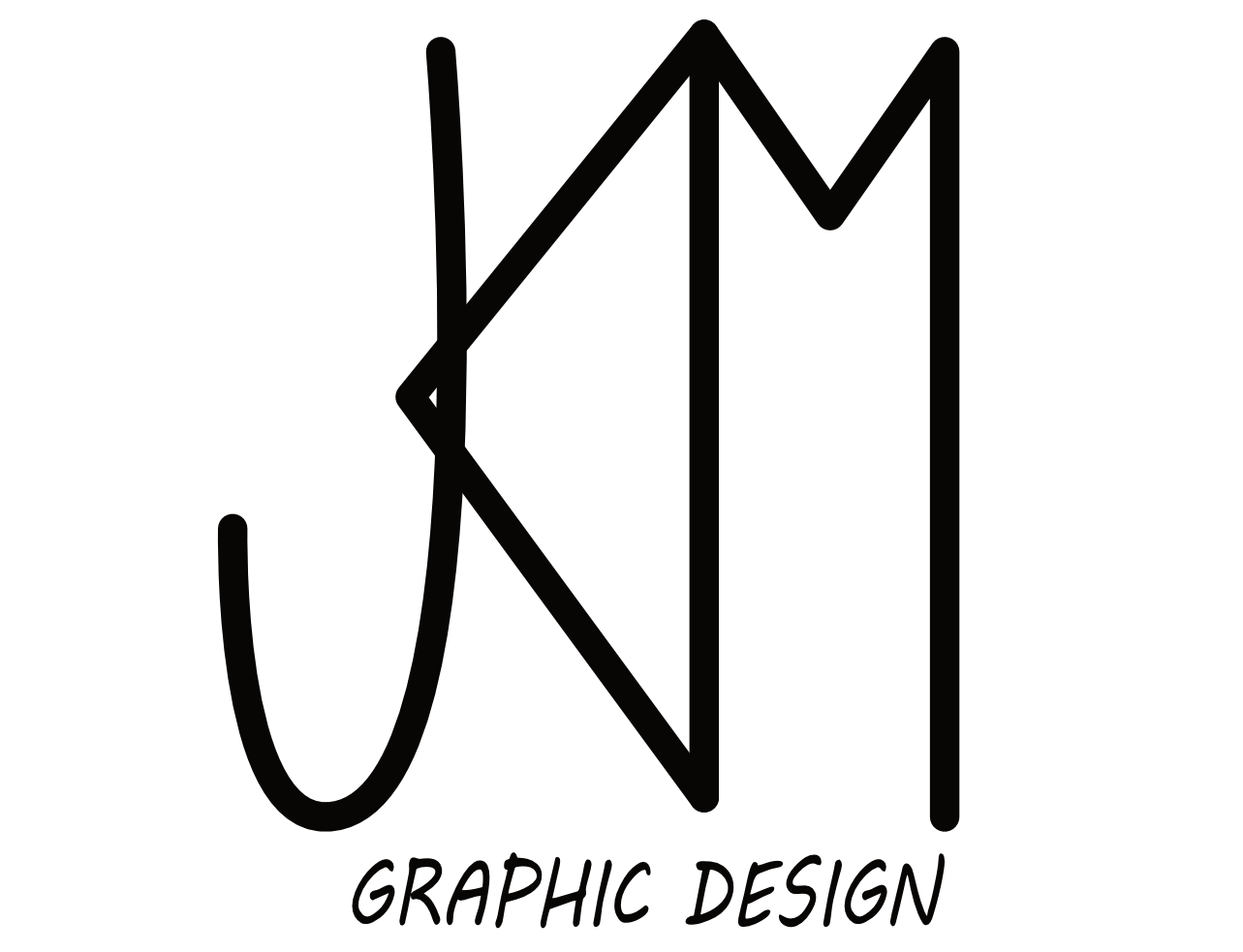
For my personal brand, I wanted to create a monogram that I could fully stand behind, one that represented me as an individual and reflected the work I am capable of producing. I aimed to convey a sense of professionalism while also showcasing my creative and playful side.
Target Audience
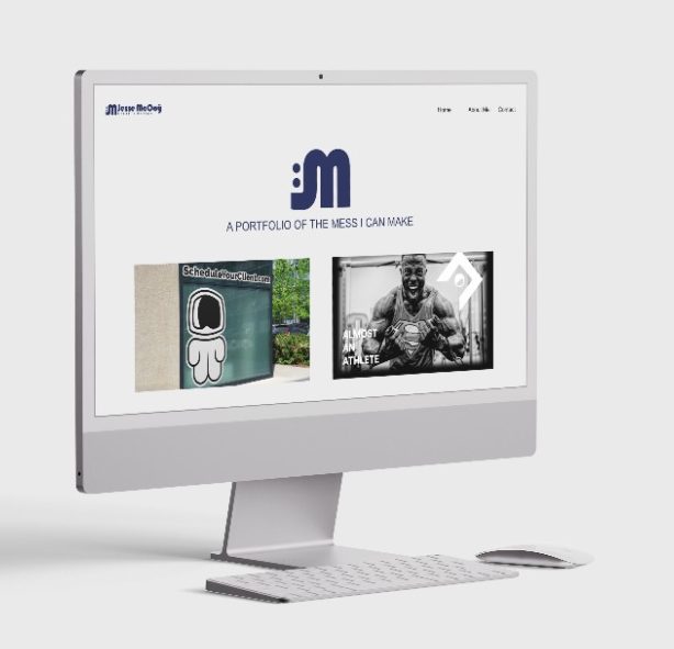
For my target audience, the ultimate goal is to reach anyone in need of design work. If I had to narrow the focus, I would concentrate on small business owners, local shops, and markets. The goal is to help these clients build and develop a visual identity that supports growth and evolves with the market and the times.
PROCESS
Sketches
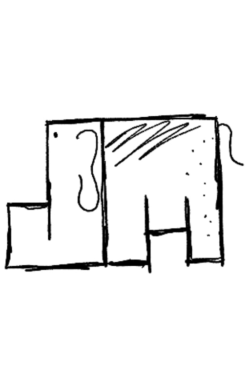
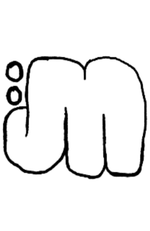
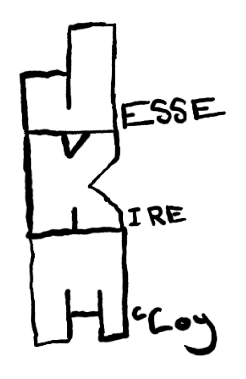
The idea behind my sketches was to explore how I could create a monogram using the letters of my name. I began by experimenting with options that included my first, middle, and last initials. As I developed these, I realized that including the middle initial made the design feel too long and cluttered. Focusing on just the first and last initials better represented my personal brand, especially since the middle initial was sharp while the other letters had a more rounded shape.
Typography
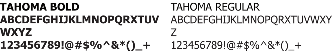
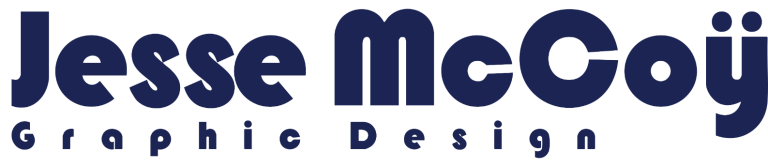
The typeface for my brand needed to be both fun and engaging while still maintaining a professional appearance that reflected expertise. Choosing a solid sans serif font like Tahoma allowed me to create a brand that feels strong, reliable, and built on a solid professional foundation.
Color Palette
I chose a very simple color palette because a brand that can work with a single color while still feeling unique and adaptable demonstrates confidence and expertise. This approach allows the brand to remain versatile and evolve with the times while maintaining a strong and recognizable identity.
Digital Drafts
Design Decision
The final design was chosen based on its ability to represent who I am as a designer. I created six different digital options and presented them all, but one stood out above the rest. It showcased a strong, independent monogram that could stand on its own while also working seamlessly alongside a typeface.
Final Iteration

Wordmark
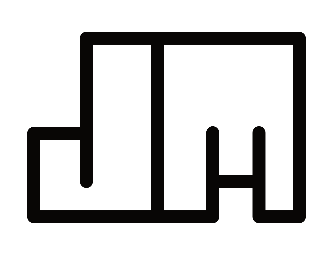
Favicon

Logo Animation
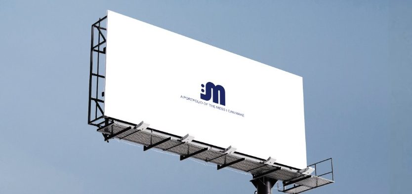
Environmental Contact