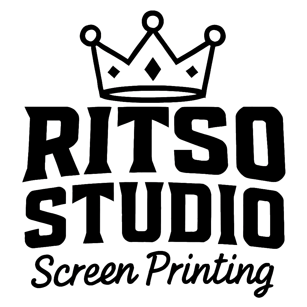
RITSO STUDIO
Project Description
With this project I created the branding for a Clothing company. This company was rooted in the understanding that art belonged on T-Shirts and wanted to offer Artists a more easy communicated process allowing them to create in amounts that worked for them to build grow and even test out new designs. The voerall understanding was that a canvas is boring and to put art on a shirt was more fun. The company itself was an urban clothing brand so grunge, concreate, sticker slapping.
Research & Development
Brand Strategy
The whole goal with this brand was to build something that could adapt and change over time but still keep the same feeling and emotion with those changes. The company always wanted to be seen as a fun artsy style group and this is why we went with the graffiti look on things. Along with this the company had no intentions of being professional they wanted to be the 90's skate life all over again.
Target Audience
This one is always tricky as we wanted to make sure that we were here for everyone in the artists community but we also understood that we needed a foundation to build off of so we dove head first into the 90's and stuck with this target demographic. The idea here is to hit the community that we speak to the most and then allow them to share us and help us grow.
PROCESS
Sketches

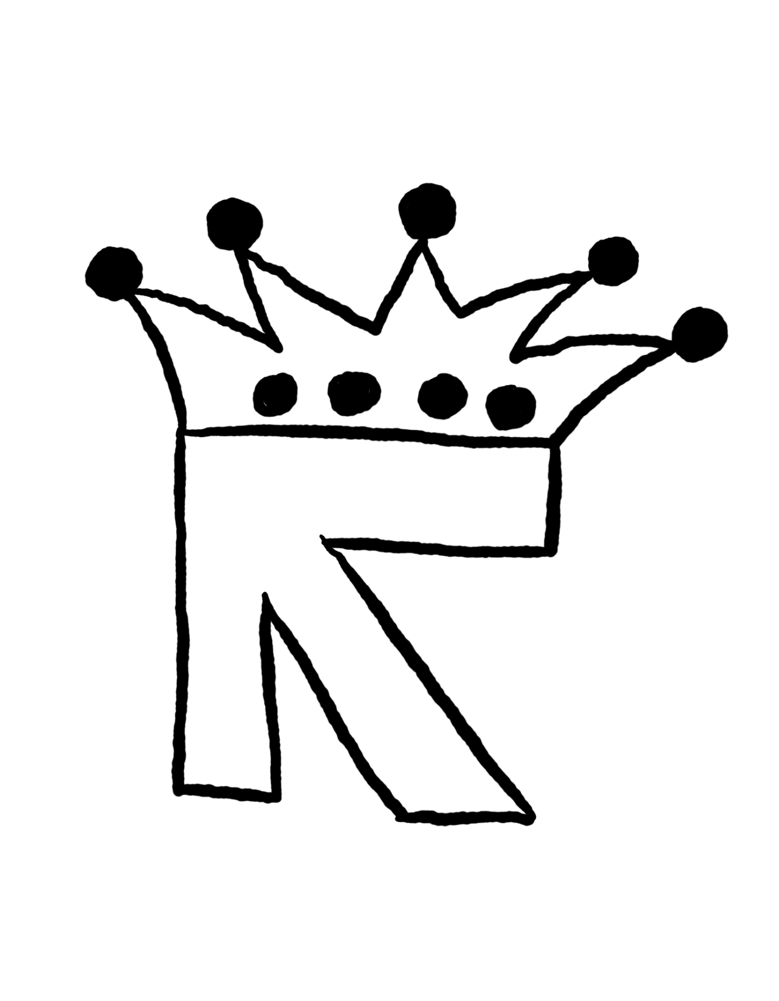
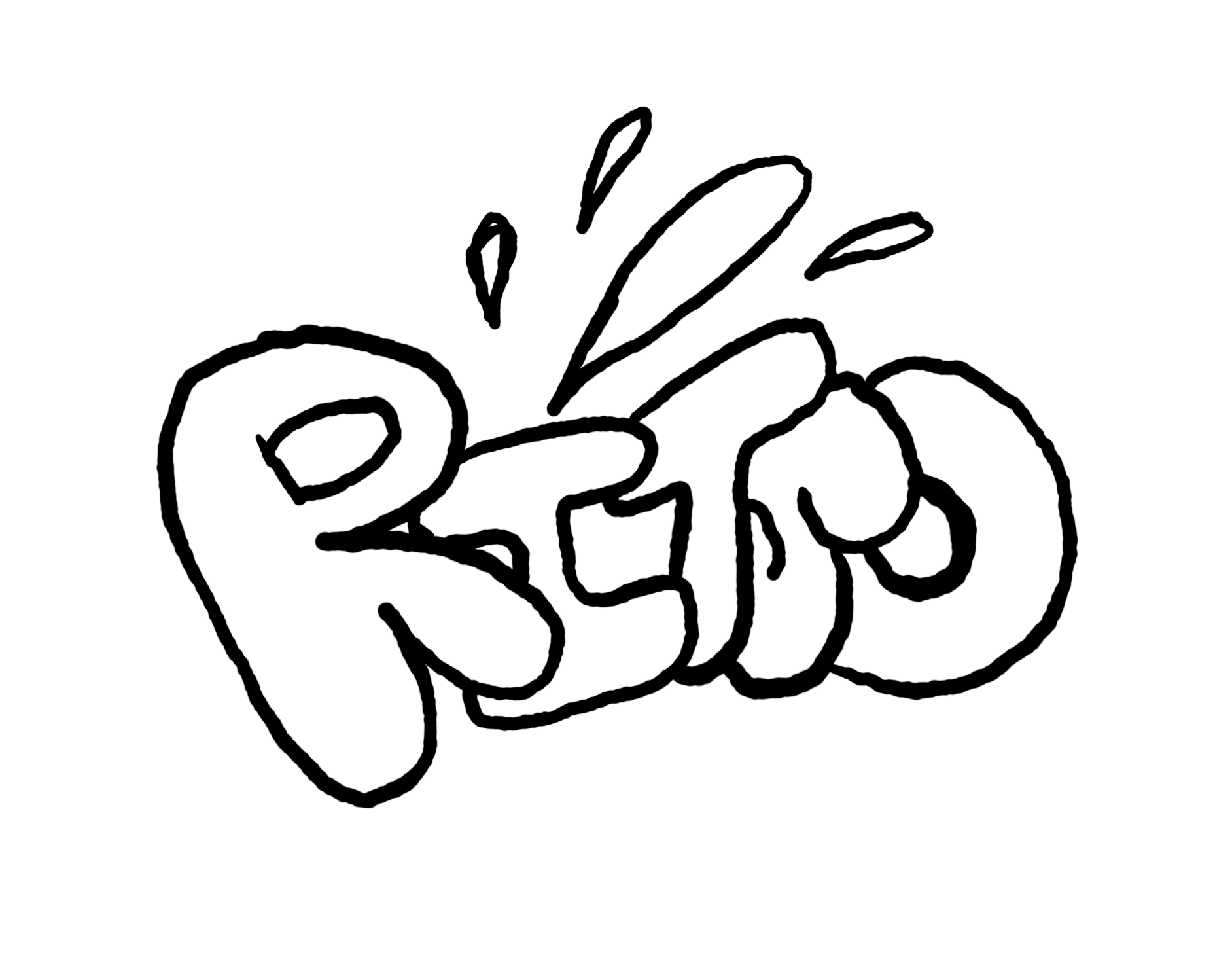
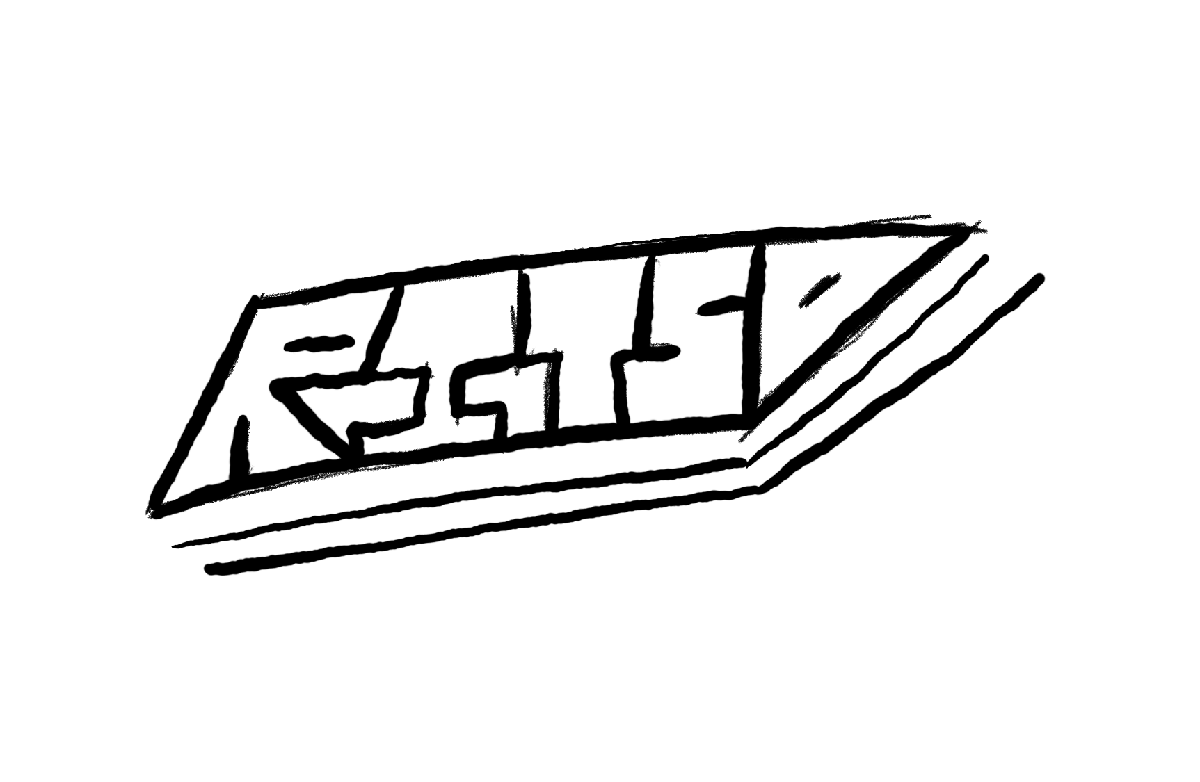
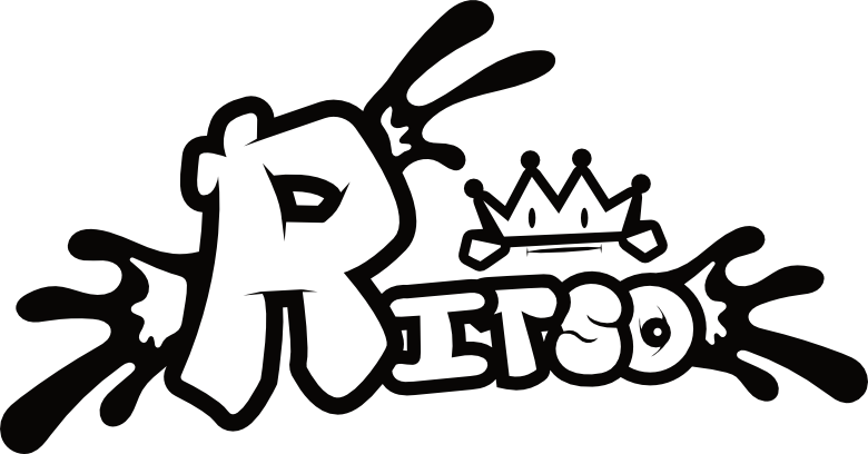
The sketching process was a lot of fun as I was able to work with total freedom on the start of the project. The company knew what they wanted to name themselves and how the wanted to feel but with no idea as how they wanted to look I was able to present a wide range of options for them to choose from and work with.
Typography
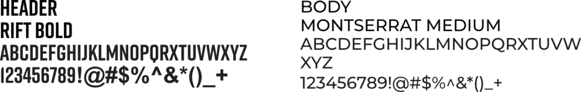
The typeface for this company was one that sowed the fun side of the company and who they were in the Urban district but it also allowed for easy digest by the viewers. The idea of using a San Serif setup allows for a solid foundation to be built.
Color Palette
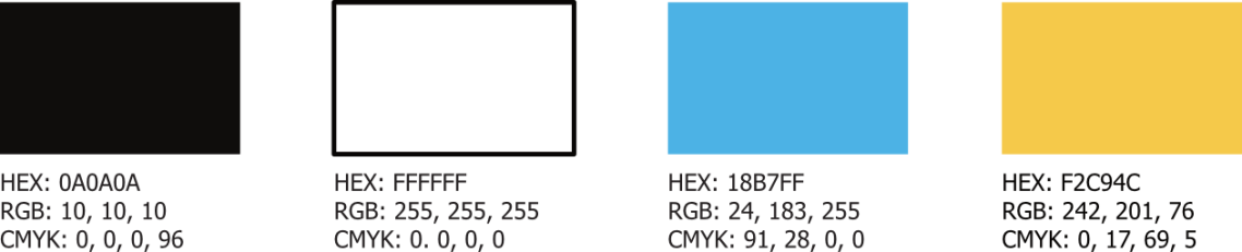
The color palette for this company is to focus on the ability to blend. So, we start with using Black and White as the initial colors allowing for the ability to blend and hide as needed but then we add in two secondary color options of a Cyan and Gold allowing for the brand to then standout be creative and look like an artistic community on its own.
Digital Drafts
Design Decision
Digital drafts for this project were the best part we were able to create some very unique and stylish logo setups for the client and in this process, we were really able to bring some depth and detail to our work really showing how it can stand out amongst the crowds.
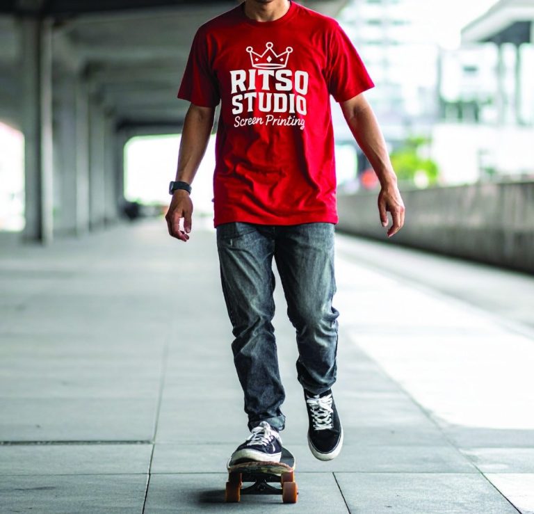
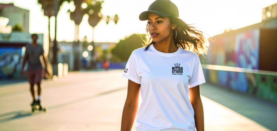
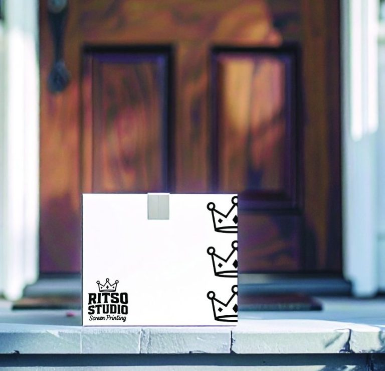
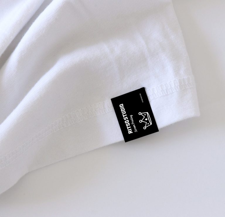
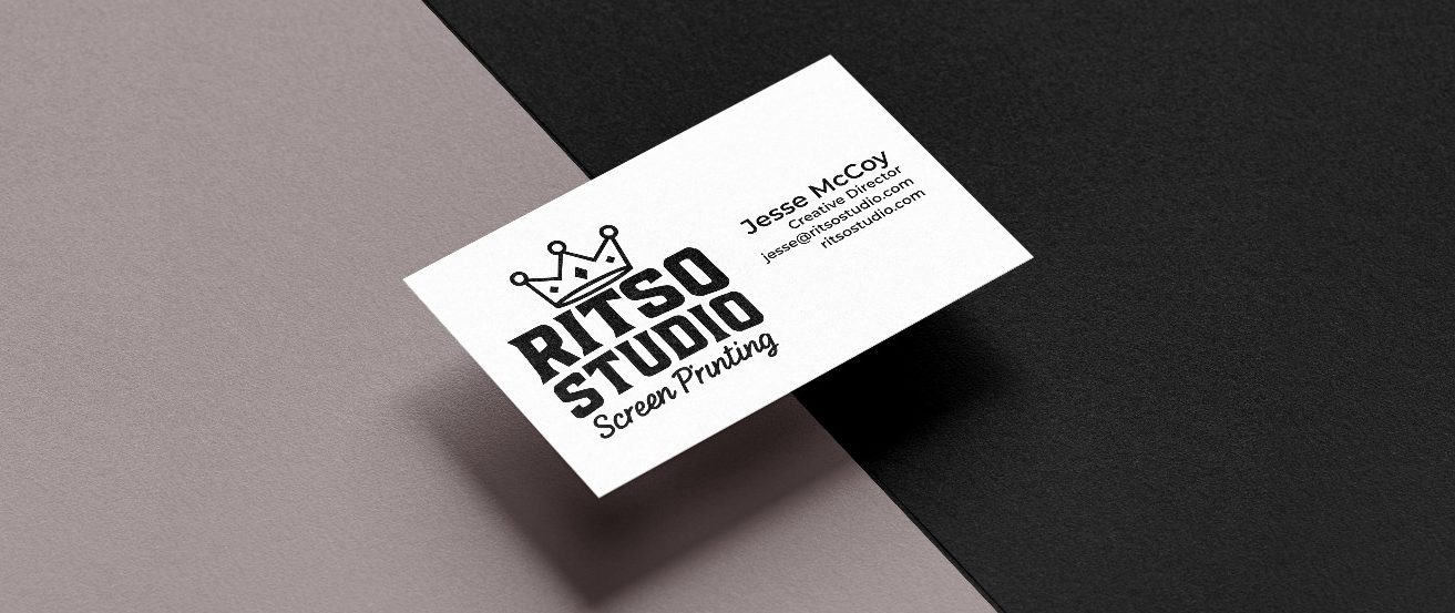
Final Iteration
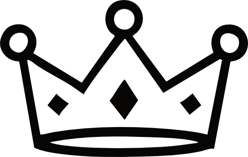
Favicon
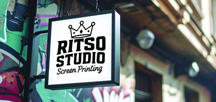
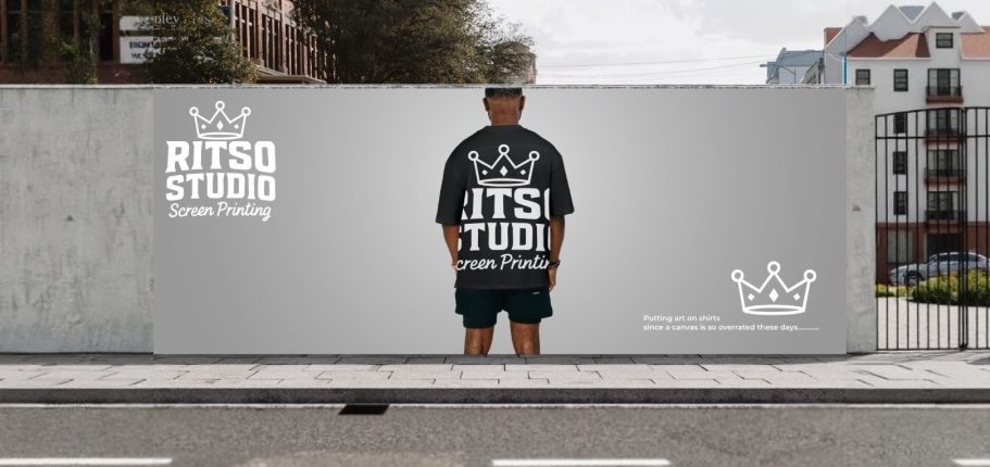
Environmental Contact